
Strike48
Building a Cybersecurity Brand from the Ground Up
Overview: Strike48 was a newly launched cybersecurity company built on the technology and legacy of Devo. As Manager of Graphic Design, I helped establish the company's visual identity by designing the logo, developing the brand system, and creating scalable marketing assets that supported product launches, digital campaigns, sales enablement, events, and customer experiences. The result was a cohesive brand foundation that enabled Strike48 to launch with a consistent and recognizable presence across every customer touchpoint.
Challenge: The primary challenge was creating a brand that established Strike48 as an independent cybersecurity company while building on the credibility of Devo's technology and legacy. A scalable visual system needed to balance continuity with differentiation, giving Strike48 a distinct personality without losing the trust associated with its foundation. The new brand also needed to support rapid go-to-market initiatives across digital marketing, sales enablement, events, and customer communications.
My Role: As Manager of Graphic Design, I led the creative development of the Strike48 brand identity by designing the company logo, establishing the visual identity, and developing the brand guidelines. I partnered with marketing, web, product, and leadership teams to extend the brand across digital marketing, sales enablement, events, presentations, and customer-facing experiences, creating a scalable design system that supported the company's growth.
Creative Decisions
Simplicity Drives Recognition: The identity was intentionally designed to be clean, confident, and easy to recognize across digital and physical applications. Simplifying the logo and supporting graphic elements improved scalability while reinforcing a strong, memorable brand presence.
Design for Flexibility: The visual system was built to adapt across a wide range of applications, from digital marketing and presentations to conference environments and branded merchandise. Consistent design principles ensured the brand remained recognizable regardless of format or scale.
Build Consistency Through Systems: Brand guidelines, templates, typography, color, and supporting graphics were developed as a cohesive system that enabled internal teams to create consistent, on-brand communications across every customer touchpoint.
Results
The completed brand system provided Strike48 with a consistent visual foundation for launch and future growth. By establishing reusable guidelines, templates, and marketing assets, the identity enabled teams across the organization to deliver cohesive customer experiences while supporting ongoing product launches, campaigns, and sales initiatives.
Logo Exploration
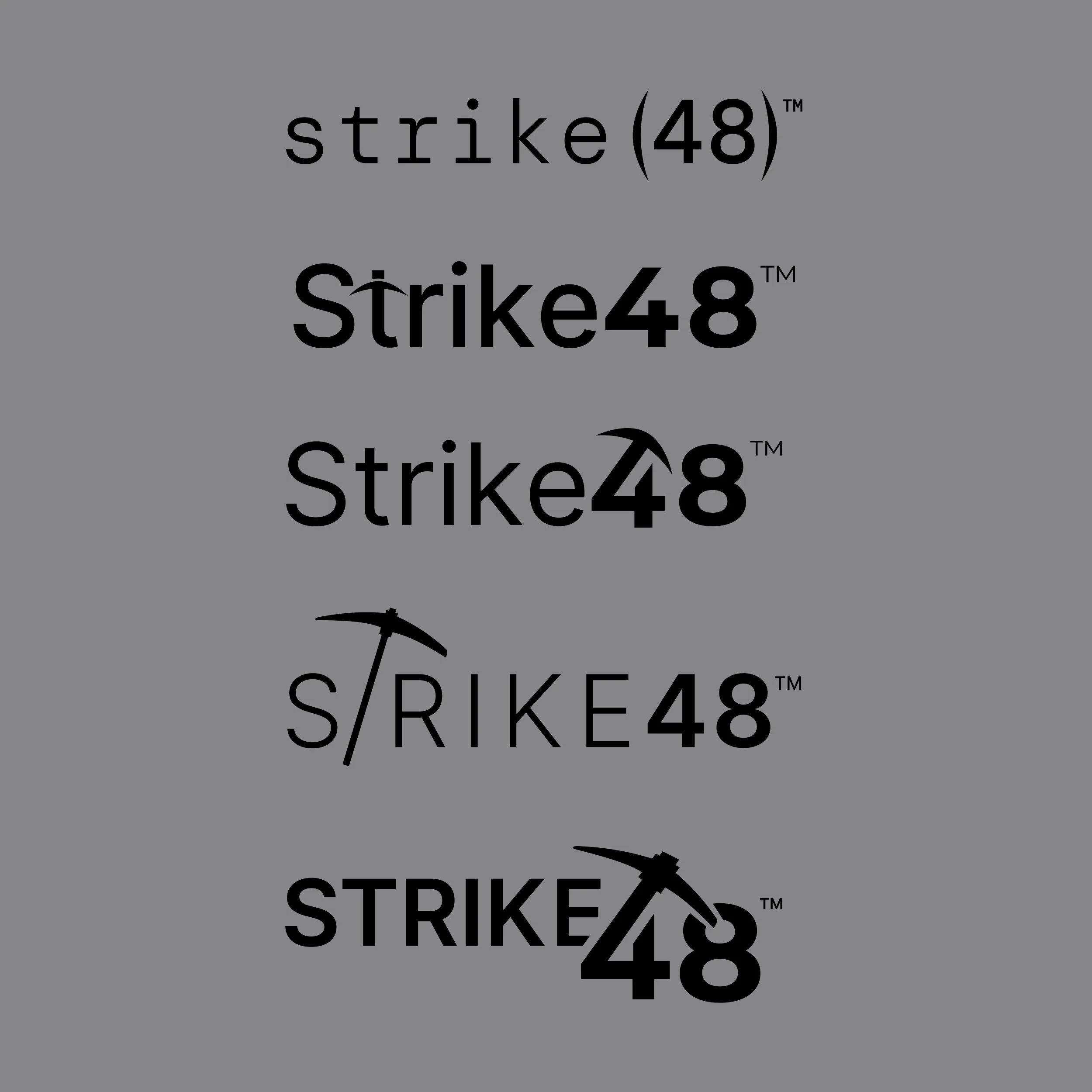
The Strike48 identity evolved through multiple rounds of exploration to balance simplicity, scalability, and brand recognition. Early concepts explored different approaches to integrating the mining-inspired pickaxe into the wordmark before arriving at a cleaner, more distinctive mark that could perform consistently across digital, print, and environmental applications.
Final Identity
The final identity combines a bold wordmark with a simplified pickaxe icon, creating a recognizable mark that reflects strength, precision, and scalability. The design was built to remain legible and impactful across applications ranging from digital interfaces to large-scale event graphics.

Brand System
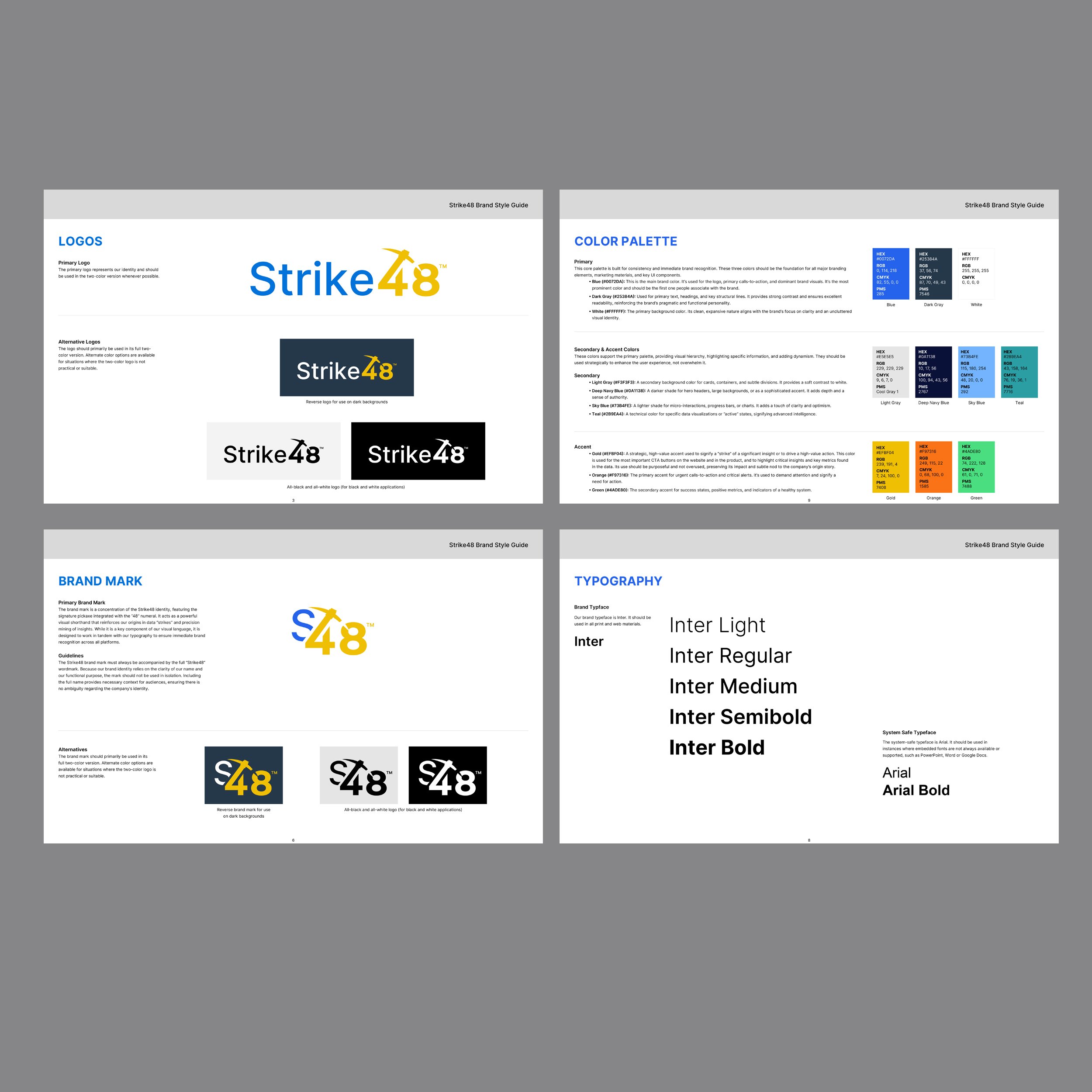
Comprehensive brand guidelines established standards for logo usage, typography, color, imagery, and supporting graphic elements. These guidelines created a shared visual language that enabled consistent brand execution across internal teams, marketing campaigns, and customer communications.
Brand in Action
The Strike48 brand system was applied across marketing, events, digital experiences, sales enablement, and customer communications, creating a consistent brand presence across every touchpoint.
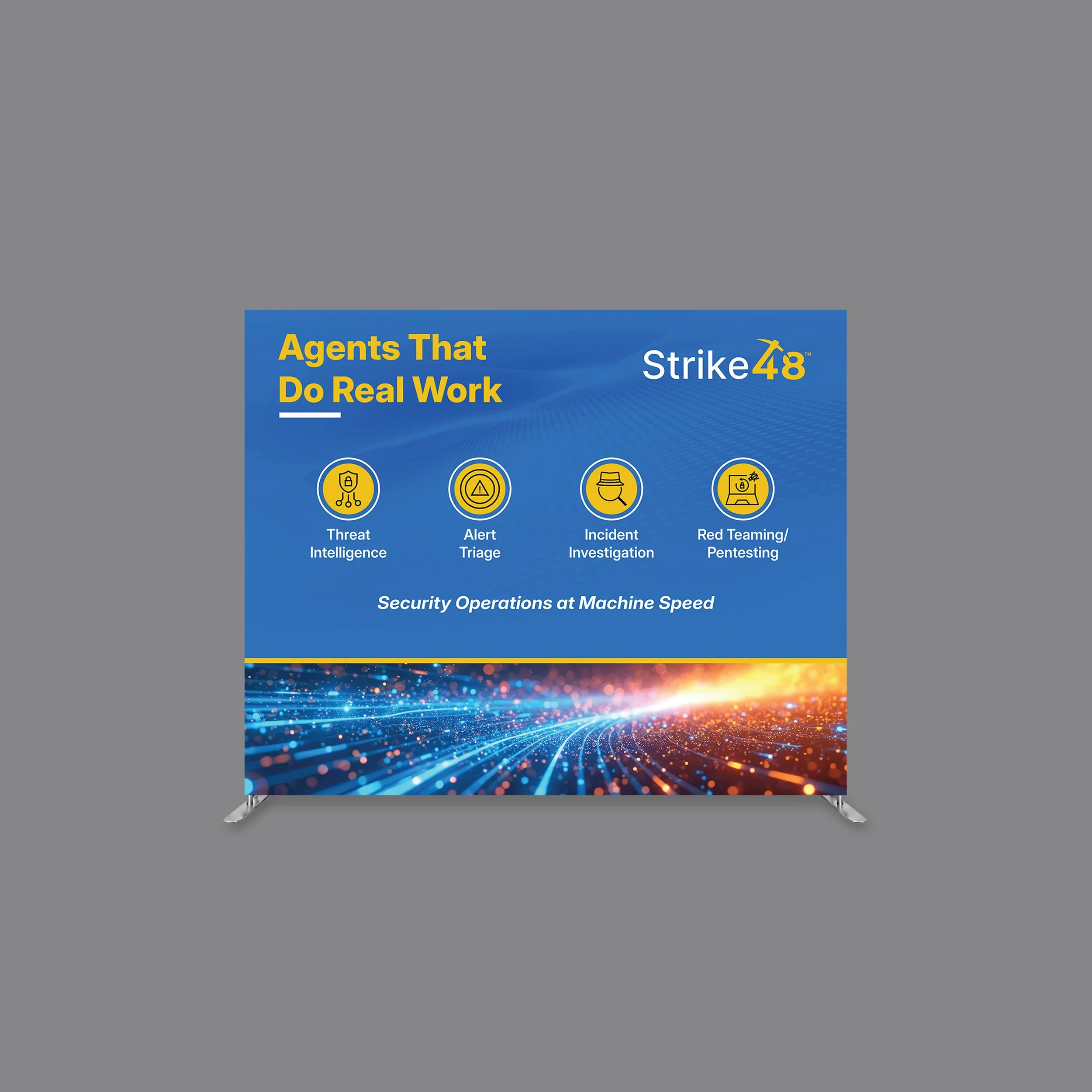
Event Experience
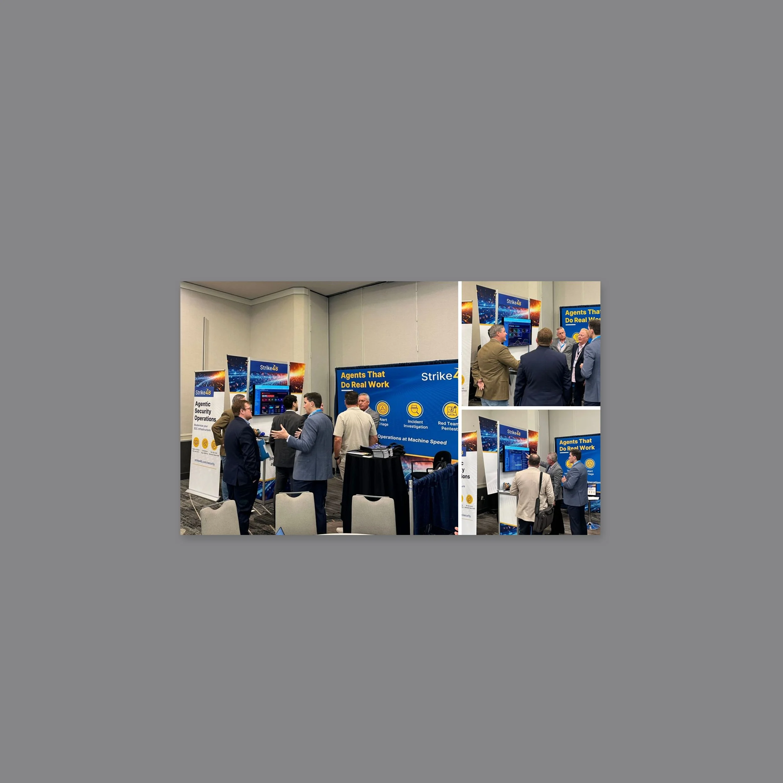
The new brand extended beyond digital channels into conferences and customer events, creating consistent experiences across physical environments.
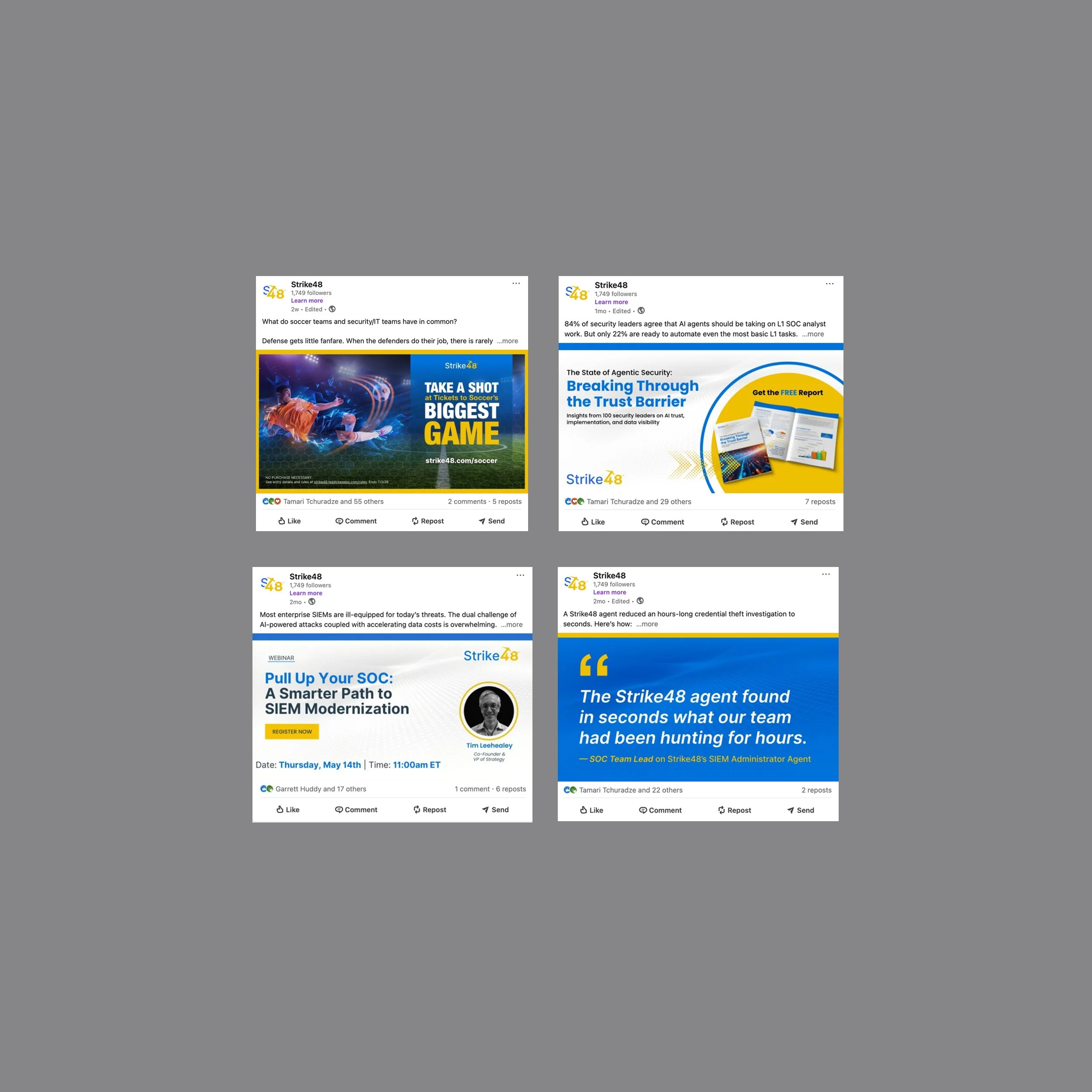
Digital Marketing
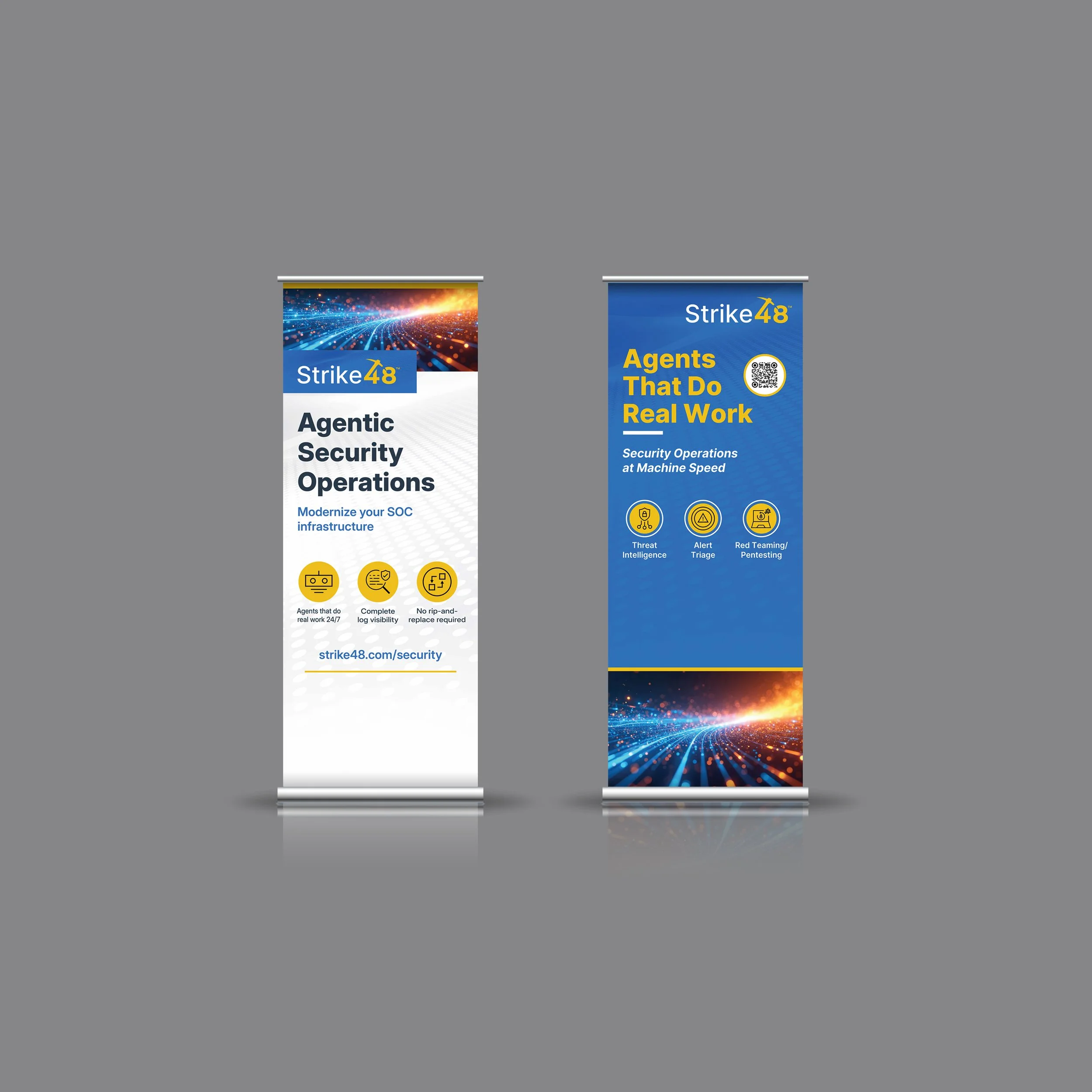
The visual identity was applied across digital marketing campaigns, social media, email communications, and product promotions, creating a consistent brand presence that supported awareness, engagement, and product messaging across multiple channels.

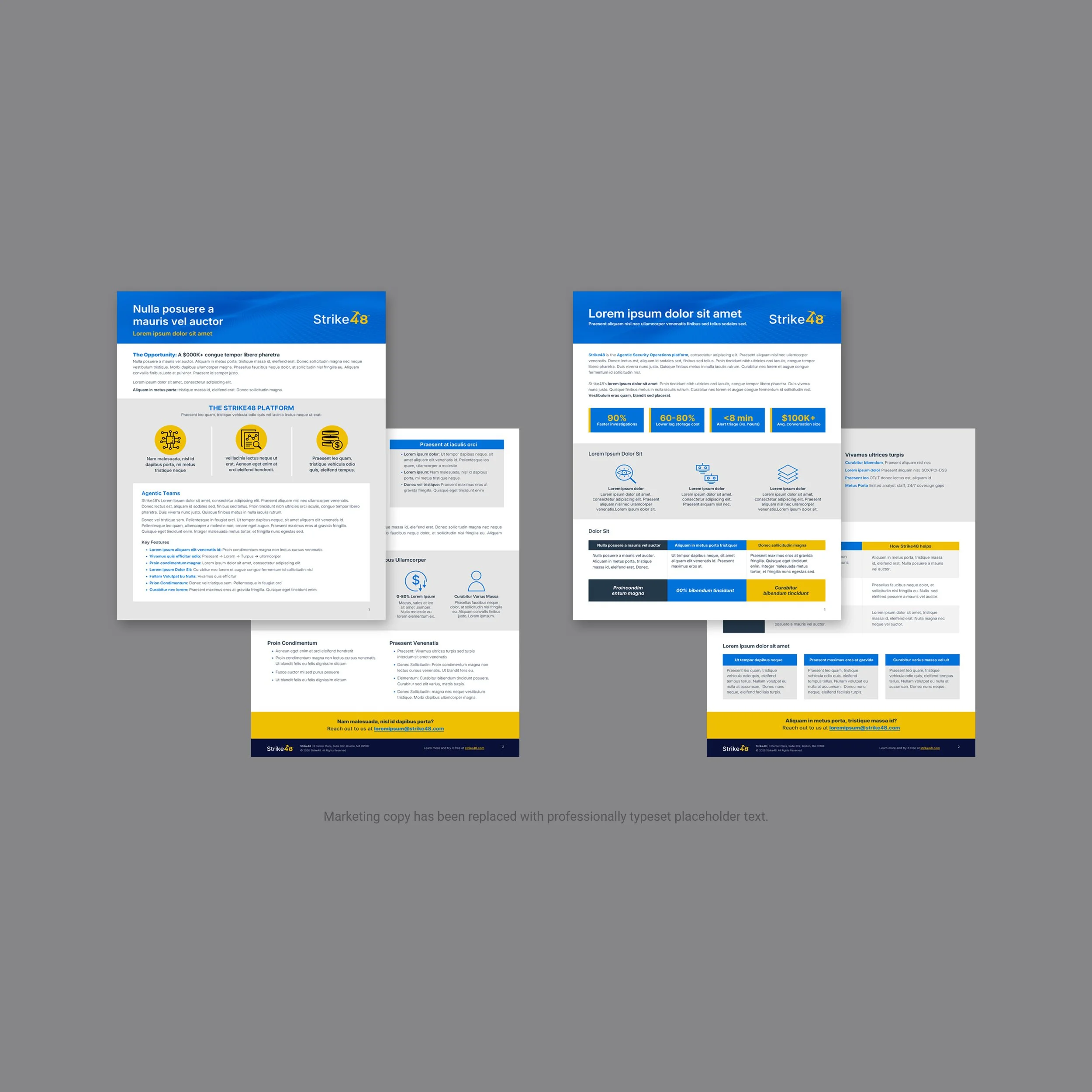
Sales Enablement
Sales materials were designed to communicate complex cybersecurity solutions through clear, visually engaging presentations, one-pagers, and supporting collateral. Consistent branding helped strengthen customer conversations while providing the sales team with scalable, reusable resources.
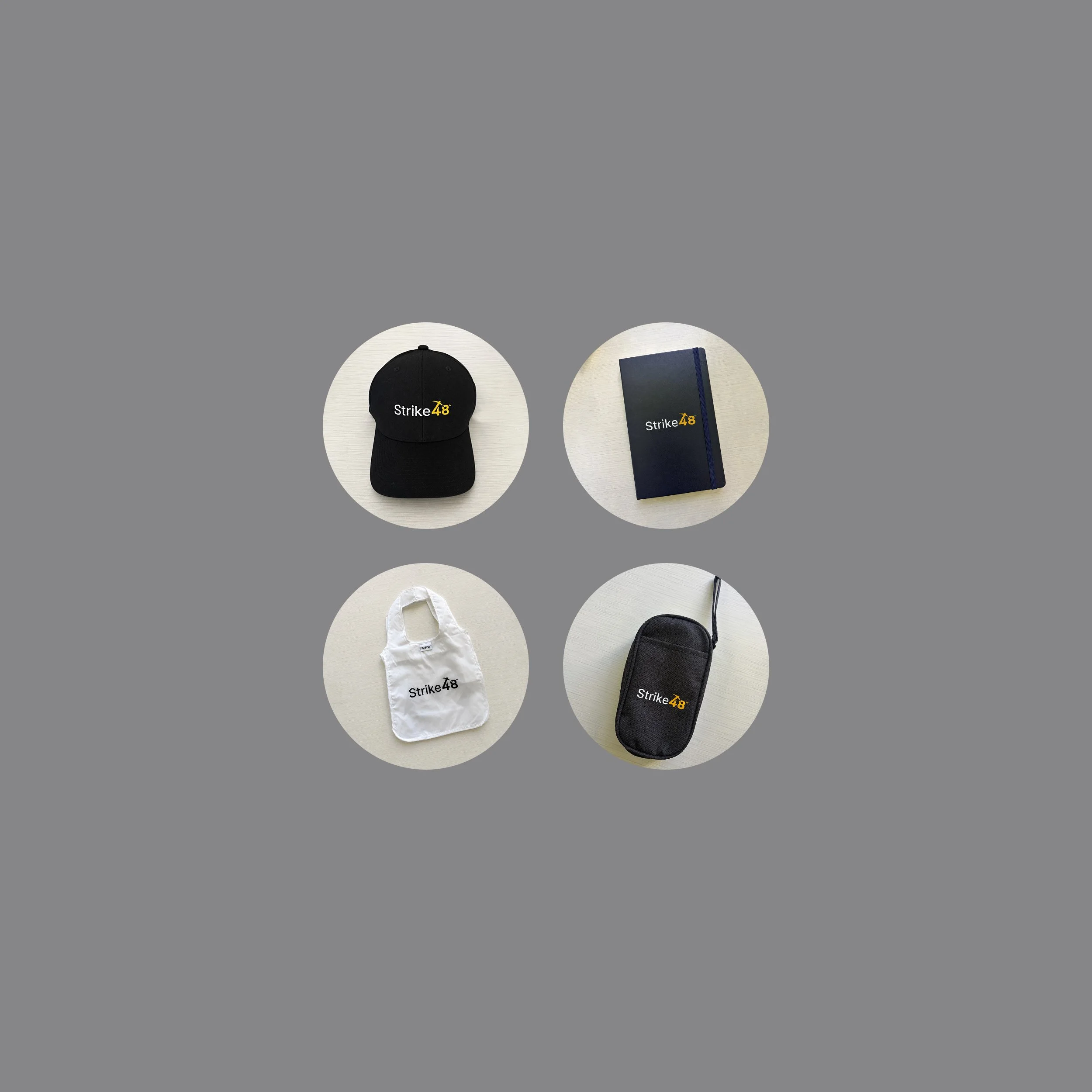
Brand Merchandise
The Strike48 visual identity extended naturally across branded merchandise and promotional materials, ensuring a consistent brand presence beyond traditional marketing channels. Every application reinforced the company's identity while increasing brand visibility at events, customer engagements, and internal initiatives.
The Strike48 brand system established a scalable visual foundation that supported marketing, product launches, customer engagement, and future brand growth across every major touchpoint.