Website Redesign
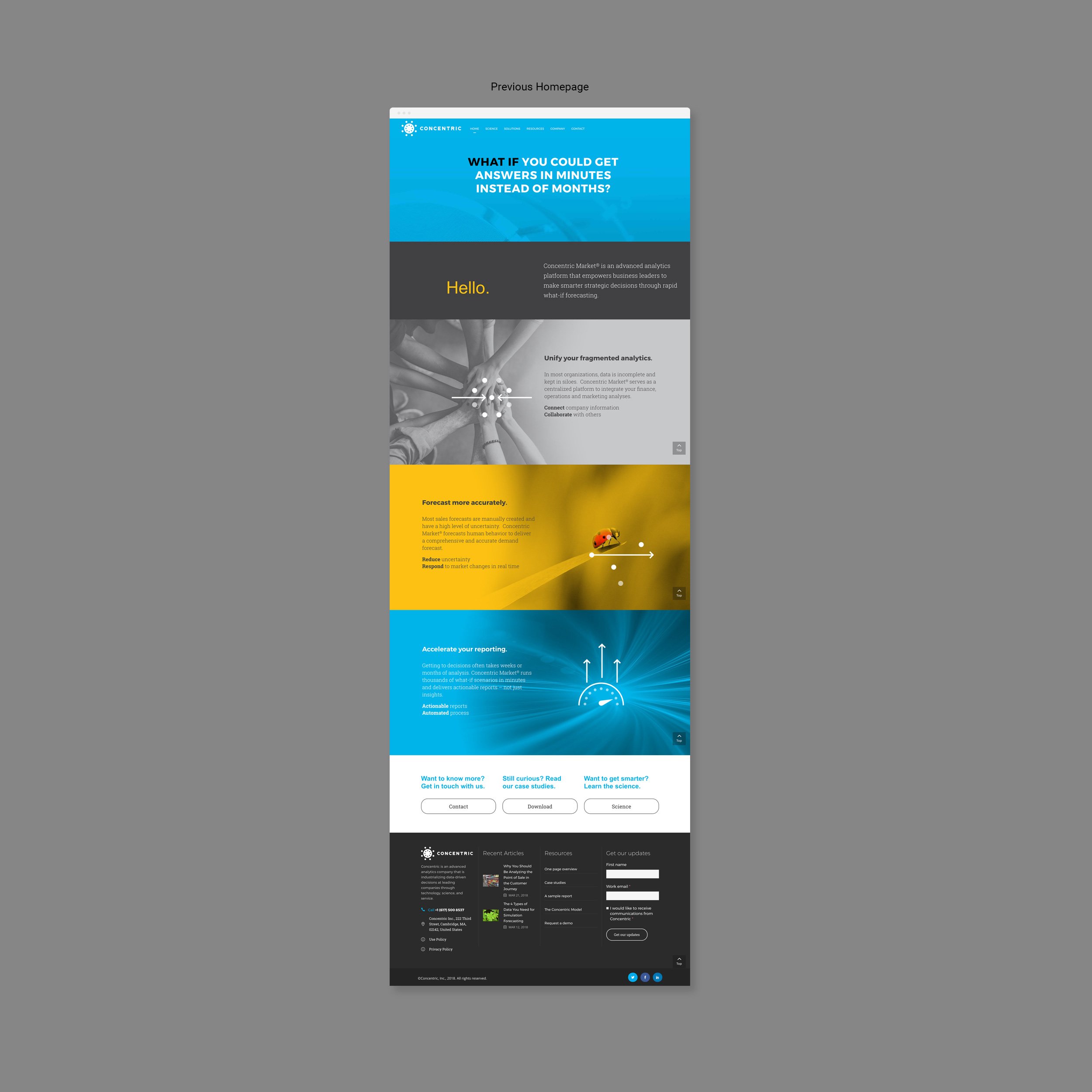
Concentrics previous website lacked clear messaging as to who and what the company did. The layout was cluttered and didn’t have a consistent flow with call to actions often hidden at the end of pages.
To address those concerns, I collaborated with department leads to create a fresh design to improve the user experience and provide clear messaging throughout the site.
Each page opened with clear messaging on a branded blue hero image. The images consisted of vibrant groups of people or items moving in a space, implying the complexity of analysis but also adding a human element, all relevant to the core brand. White and grays paced the flow of the page and allowed the copy to be easily scanned. Call to action buttons were clearly positioned throughout.


