Logo Design
For the launch of Devo’s new product, Strike48, I designed the logo and brand guidelines. Strike48 reflects the modern-day gold rush, where the most valuable untapped resource isn’t a precious metal, but an organization’s log data. Referencing the pivotal year 1848, the name draws a parallel to an era defined by bold exploration and the discovery of transformative value.
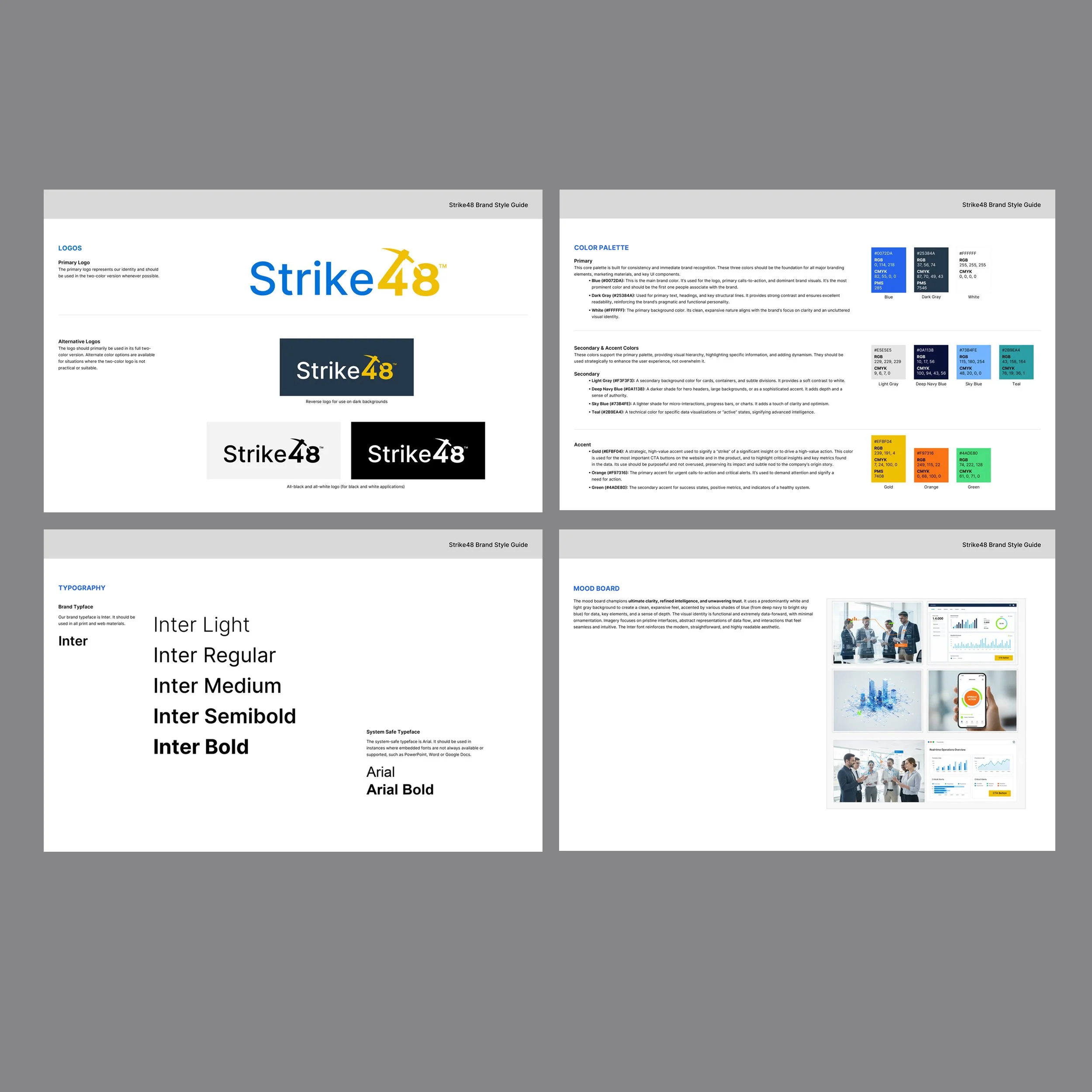
The logo was designed to convey discovery, drawing inspiration from the pickaxe as a subtle nod to Strike48’s origin story. Early concepts explored how form alone could suggest the act of uncovering value without relying on literal representation. Through review and refinement, the final logo emerged as a simple, modern mark that feels confident, clear, and easy to recognize across marketing materials, product experiences, and presentations.
Logo Concepts